“Modernistic-Abstractionist-Art… consists of 75% explanation and 25% God knows what!”
Statement to William O. Chessman (27 March 1936); as quoted in Maxfield Parrish by Coy Ludwig (1997)
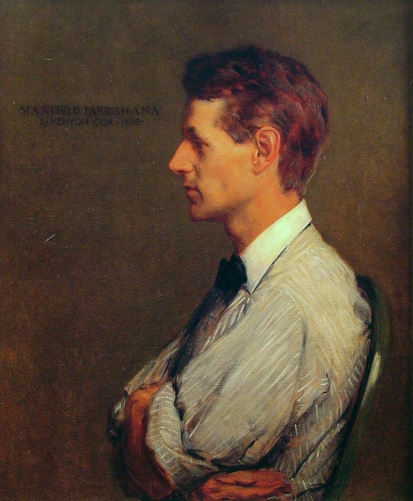
Maxfield Parrish was an American painter and illustrator active in the first half of the 20th century. He is known for his distinctive saturated hues and idealized neo-classical imagery. His career spanned fifty years and was wildly successful: his painting Daybreak is the most popular art print of the 20th century. Wikipedia
“Modernistic-Abstractionist-Art… consists of 75% explanation and 25% God knows what!”
Statement to William O. Chessman (27 March 1936); as quoted in Maxfield Parrish by Coy Ludwig (1997)
“Thank you for allowing me to use colors as rich and deep as you please.”
Letter to Gertrude Whitney (8 April 1914)
Context: Thank you for allowing me to use colors as rich and deep as you please. I had always wanted to do so, yet was never allowed because of the color capabilities of our lithographers today. Now that I have done it, I don't think I'll ever go back.
Letter to F.W Weber (1950); published in New York—Pennsylvania Collector (8 August 1991)
Context: How do ideas come? What a question! If they come of their own accord, they are apt to arrive at the most unexpected time and place. For the most part the place is out of doors, for up in this northern wilderness when nature puts on a show it is an inspiring one. There seem to be magic days once in a while, with some rare quality of light that hold a body spellbound: In sub-zero weather there will be a burst of unbelievable color when the mountain turns a deep purple, a thing it refuses to do in summer. Then comes the hard part: how to plan a picture so as to give to others what has happened to you. To render in paint an experience, to suggest the sense of light and color, air and space, there is no such thing as sitting down outside and trying to make a “portrait” of it. It lasts for only a minute, for one thing, and it isn’t an inspiration that can be copied on the spot...
“Now that I have done it, I don't think I'll ever go back.”
Letter to Gertrude Whitney (8 April 1914)
Context: Thank you for allowing me to use colors as rich and deep as you please. I had always wanted to do so, yet was never allowed because of the color capabilities of our lithographers today. Now that I have done it, I don't think I'll ever go back.
Turning down an offer of payment from Irénée du Pont in 1954 for a second mural after one he had finished in 1933 began to deteriorate because of improperly dried paint; as quoted in "How Maxfield Parrish Fulfilled a Warranty" by Seth W. Mattingly in Valley News [Lebanon, NH] (10 February 1982), p.2.
"Maxfield Parrish Will Discard 'Girl-on-Rock' Idea in Art" Associated Press (27 April 1931)
Letter to A. E. Reinthal (15 February 1929)
"Bit of a Come-Back Puzzles Parrish" in The New York Times (3 June 1964)
Letter to F.W Weber (1950); as quoted in Maxfield Parrish by Coy Ludwig (1997)
Context: It is generally admitted that the most beautiful qualities of a color are in its transparent state, applied over a white ground with the light shining through the color. A modern Kodachrome is a delight when held up to the light with color luminous like stained glass. So many ask what is meant by transparent color, as though it were some special make. Most all color an artist uses is transparent: only a few are opaque, such as vermillion, cerulean blue, emerald green, the ochres and most yellows, etc. Colors are applied just as they come from the tube, the original purity and quality is never lost: a purple is pure rose madder glowing through a glaze of pure blue over glaze, or vice versa, the quality of each is never vitiated by mixing them together. Mix a rose madder with white, let us say, and you get a pink, quite different from the original madder, and the result is a surface color instead of a transparent one, a color you look on instead of into. One does not paint long out of doors before it becomes apparent that a green tree has a lot of red in it. You may not see the red because your eye is blinded by the strong green, but it is there never the less. So if you mix a red with the green you get a sort of mud, each color killing the other. But by the other method. when the green is dry and a rose madder glazed over it you are apt to get what is wanted, and have a richness and glow of one color shining through the other, not to be had by mixing. Imagine a Rembrandt if his magic browns were mixed together instead of glazed. The result would be a kind of chocolate. Then too, by this method of keeping colors by themselves some can be used which are taboo in mixtures.
Letter to F.W Weber (1950); published in New York—Pennsylvania Collector (8 August 1991)
Context: How do ideas come? What a question! If they come of their own accord, they are apt to arrive at the most unexpected time and place. For the most part the place is out of doors, for up in this northern wilderness when nature puts on a show it is an inspiring one. There seem to be magic days once in a while, with some rare quality of light that hold a body spellbound: In sub-zero weather there will be a burst of unbelievable color when the mountain turns a deep purple, a thing it refuses to do in summer. Then comes the hard part: how to plan a picture so as to give to others what has happened to you. To render in paint an experience, to suggest the sense of light and color, air and space, there is no such thing as sitting down outside and trying to make a “portrait” of it. It lasts for only a minute, for one thing, and it isn’t an inspiration that can be copied on the spot...
Letter to F.W Weber (1950); as quoted in Maxfield Parrish by Coy Ludwig (1997)
Context: It is generally admitted that the most beautiful qualities of a color are in its transparent state, applied over a white ground with the light shining through the color. A modern Kodachrome is a delight when held up to the light with color luminous like stained glass. So many ask what is meant by transparent color, as though it were some special make. Most all color an artist uses is transparent: only a few are opaque, such as vermillion, cerulean blue, emerald green, the ochres and most yellows, etc. Colors are applied just as they come from the tube, the original purity and quality is never lost: a purple is pure rose madder glowing through a glaze of pure blue over glaze, or vice versa, the quality of each is never vitiated by mixing them together. Mix a rose madder with white, let us say, and you get a pink, quite different from the original madder, and the result is a surface color instead of a transparent one, a color you look on instead of into. One does not paint long out of doors before it becomes apparent that a green tree has a lot of red in it. You may not see the red because your eye is blinded by the strong green, but it is there never the less. So if you mix a red with the green you get a sort of mud, each color killing the other. But by the other method. when the green is dry and a rose madder glazed over it you are apt to get what is wanted, and have a richness and glow of one color shining through the other, not to be had by mixing. Imagine a Rembrandt if his magic browns were mixed together instead of glazed. The result would be a kind of chocolate. Then too, by this method of keeping colors by themselves some can be used which are taboo in mixtures.